professional creative tools

Designing a scalable timeline interface

Scenery is a real-time collaborative video editing web application, almost like FigJam for Final Cut Pro X. The company has since been acquired by Adobe.

Background

When I joined the company as their only full-time product designer, I inherited a design process that had been pieced together by a front-end engineer without formal design training, supplemented by occasional input from Final Cut Pro X team contractors. There wasn’t a cohesive design process or a clear understanding of who we were designing for. One of my favorite projects was tackling the timeline — one of the most heavily used parts of the product, and also one of the most frustrating.

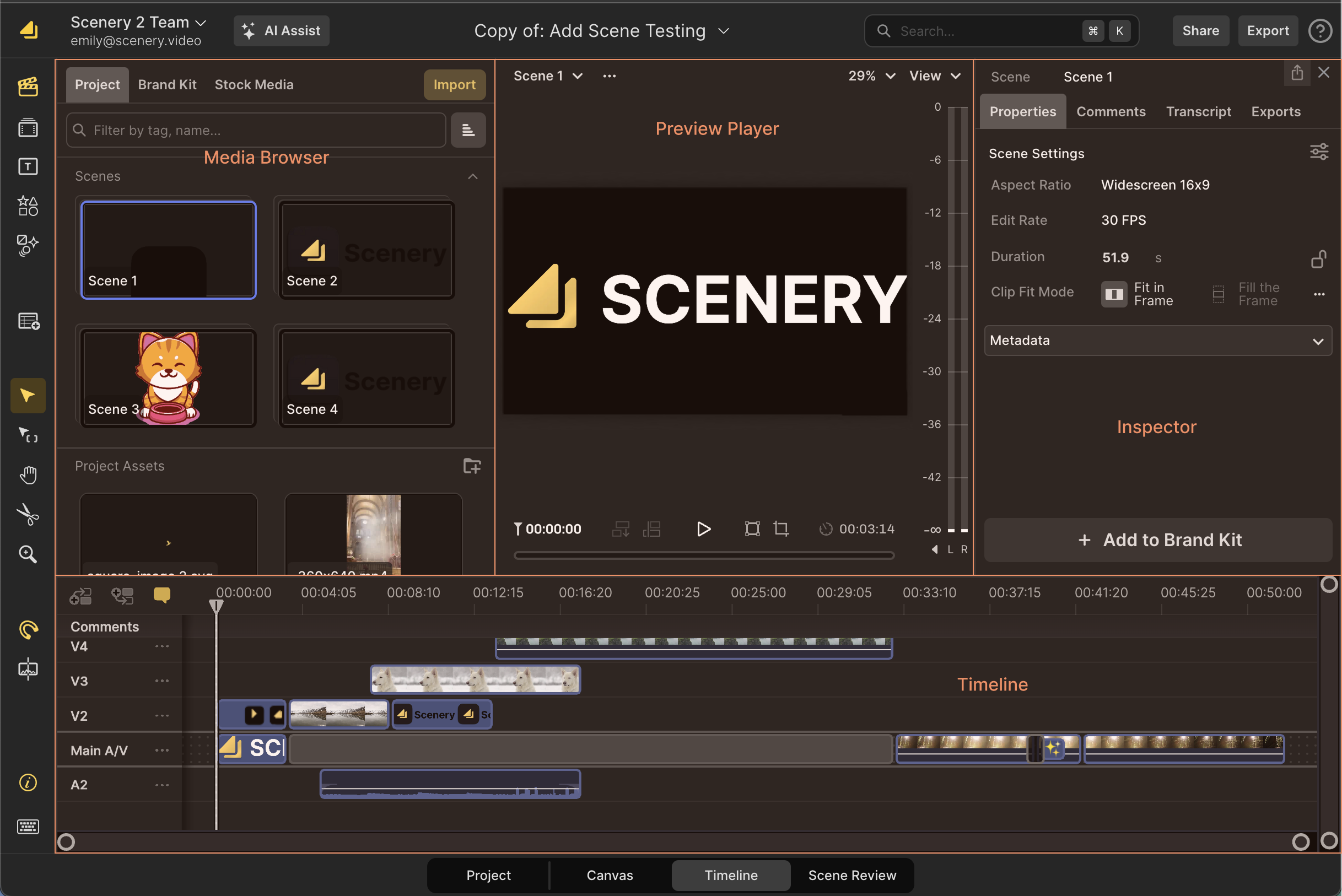
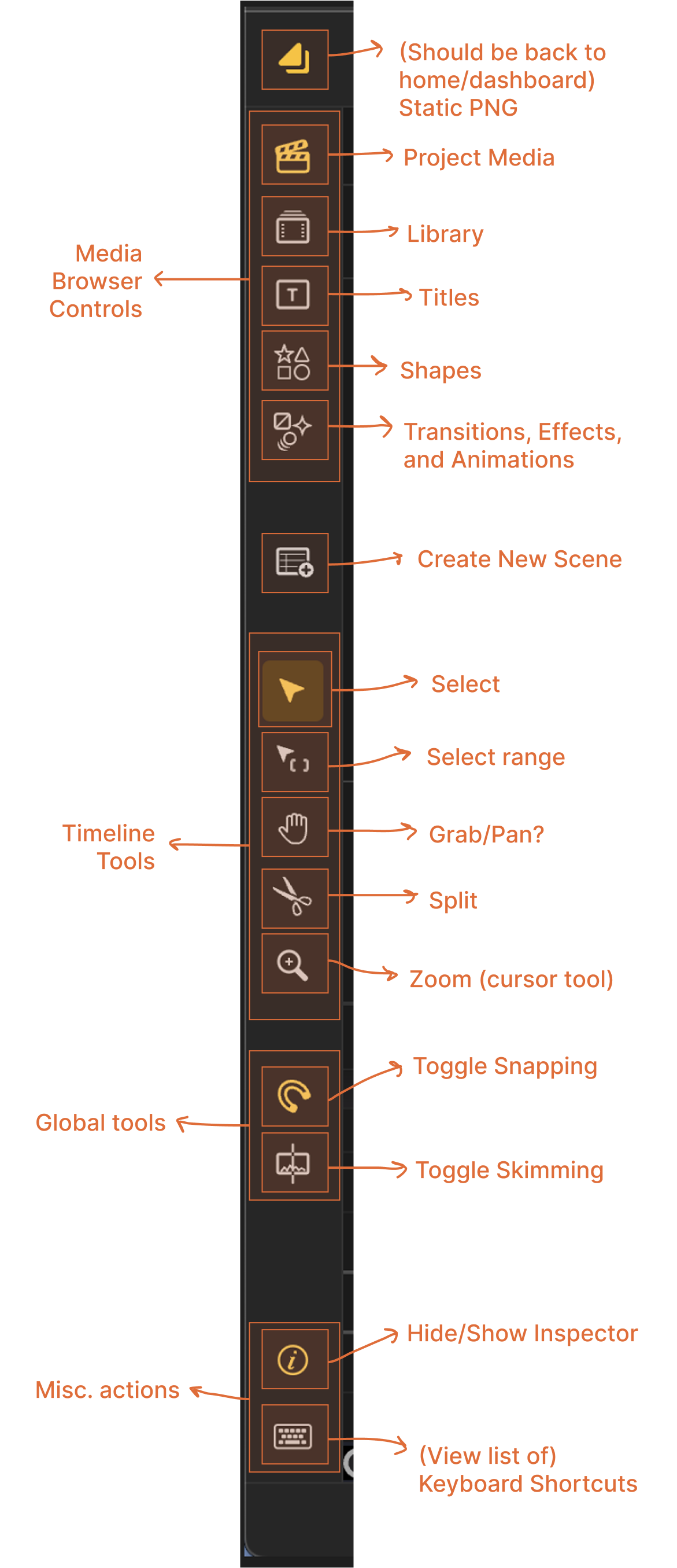
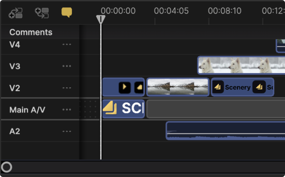
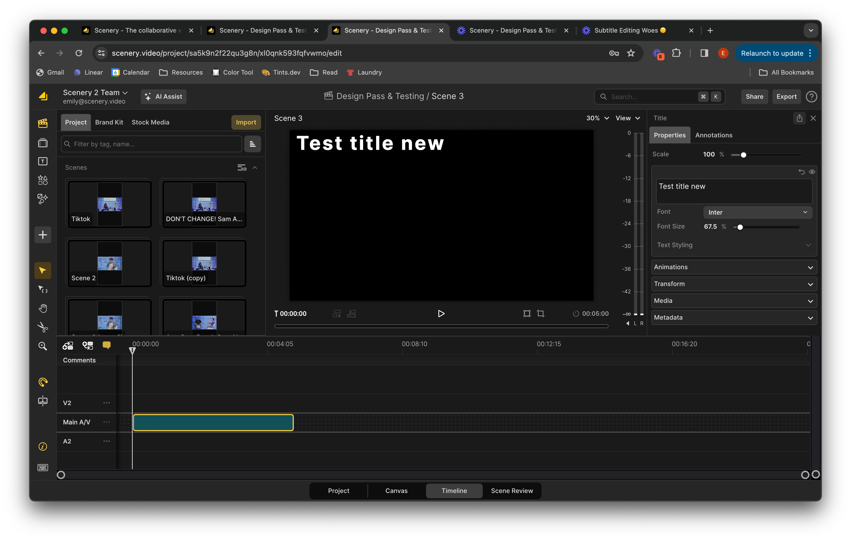
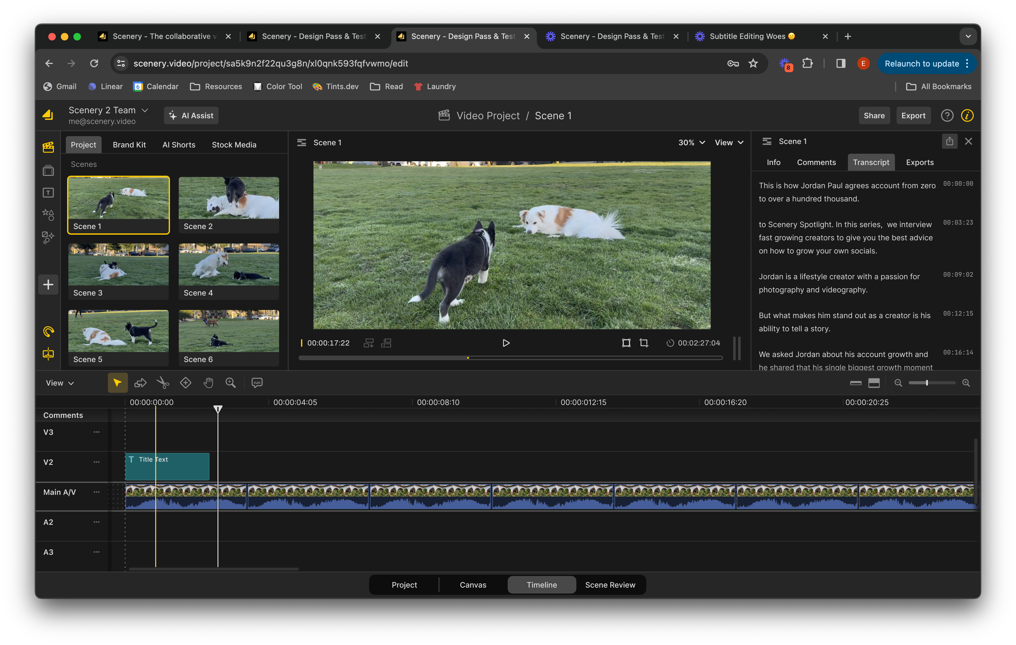
Scenery’s editor had grown organically over time. The toolbar was filled with a mix of tools and filters that weren’t organized in any logical way. The timeline was filled with problems. Many of the features regularly used by professionals weren’t discoverable, adding transitions or animations made it impossible to adjust audio levels on a clip in the future, and if you happened to bump your trackpad or scroll while inside of the timeline, you would lose your place and completely change the vertical and horizontal zoom of everything inside.

Employees had been pushing for a modular version of the application for a while, but it wasn’t until a hack day — when an engineer named Jay created a working prototype (in a day!) — that the idea was given the go-ahead. His proof of concept created a window for me to step in and take the redesign from idea to implementation while improving the editing experience for our users.

the project

A modular redesign of the video editor’s timeline — initiated, researched, and designed solo to improve clarity, reduce clutter, and create a foundation for future growth.

Identifying problems

To begin, I set up time with my coworkers, especially subject matter experts with experience in professional video editing, asking them to show me their editing process. I made it clear that I wasn’t here to judge or defend the product. I just wanted to hear what was working and what wasn’t.

I also reviewed open tickets related to the timeline, explored past design files to understand what had been tried and why it might have failed, and reached out to coworkers who were experienced editors. They walked me through their workflows in tools like Avid, Resolve, and Final Cut, which gave me valuable context for what professional editors expect and rely on.

Along the way, I kept returning to a core question: who are we designing for? I asked leadership for clarity on our target audience, but they were reluctant to define one. So, I chose to focus on improving the experience for the users we already had — creative professionals who needed a powerful, flexible editing interface that could also support newer users without being overwhelming.

Side tangent... My take on user research

When doing user research, I’m careful to pay attention to what users seem to have trouble with, points of friction, and work to understand the problem for myself before asking users themselves for solutions. I believe that a fresh perspective on an issue, coming from a place of wanting to make their lives easier and facilitate these super talented people, allows me to identify and diagnose issues with the user experience that prevent it from seeming second nature or intuitive.

My goal when designing a product or feature is to have the user eventually find the tool themselves without guidance or agitation. I want their experience to feel like walking into someone’s well-designed kitchen and finding everything you’re looking for in the first place you check.

When I conduct any user research, I like to give them a task to accomplish, sometimes broken into steps and phases as needed, and sit quietly and watch them work while they walk me through how to do things. By doing this, I’ve been able to identify workarounds and unconventional ways users have figured out how to use the product that they might not explain to me otherwise. I can see when they automatically mouse over to one side of the screen to click a button, only to hesitate when they don’t find what they’re looking for. In my experience, users don’t like making mistakes in front of others and often feel uncomfortable complaining about things if they think the researcher designed it.

I like to start these sessions by telling users something along the lines of: “I would just like to say before we begin, that this product is supposed to be designed for human beings like you. You can’t mess up here. Any mistakes you think you make are really mistakes that we have made. It means we have improvements to make.”

Problems identified

Through conversations with editors, review of design files and support tickets, and observation of real workflows, I identified several recurring problems in the timeline interface. These issues ranged from tool discoverability to unintuitive interactions and layout constraints that made the editing experience feel clunky and frustrating.

The editor can be broken into distinct regions that we wanted to make modular: the media browser, the viewer, the inspector, and the timeline. Each region in the editor has its own respective tools and controls, but they were all being stored in one large, vertical toolbar separate from all regions.
UI showing the toolbar before I made changes to it

The vertical toolbar on the left-hand side of the site did not feel intuitive. It was hard to tell what part of the app each tool was for. In this annotated image of the UI, you can see my breakdown of the original toolbar.

The toolbar was a single vertical strip packed with a wide variety of unrelated tools, toggles, and filters, which made it hard to use and even harder to scale. I explored a number of directions before splitting the toolbar into two separate parts: one for the media browser, and a separate, horizontal one for the timeline. This gave the interface more breathing room, made room for future tools and features, and grouped tools with the regions they affected.

I folded keyboard shortcuts into the tools themselves and moved the hide/show Inspector toggle across the page to sit above the Inspector panel.

Key changes to the timeline

The vertical toolbar on the left-hand side of the site did not feel intuitive. It was hard to tell what part of the app each tool was for. This is how I broke down what was contained in the toolbar.

Timeline UI showing zoom controls before
Problem — The existing scrollbars and zoom interaction were not intuitive. Anyone using a touchpad could easily lose their spot by significantly altering the visible range and the level of zoom. This was a common complaint from our users.
Timeline UI showing zoom controls after
Solution — Breaking zoom tools out of the scroll bars allows users to manage what they are viewing and how they are viewing it separately. Track height adjustments are now stepped, making it easy to switch between a previously used level of zoom and a new one. Time-based zoom could now be controlled using the buttons or stepped slider. The previous scroll bars were replaced with low-profile standard ones, but remain visible at all times.
Timeline UI showing visibility and controls before
Problem — View options on the timeline were not intuitive. The new transcription tool needed to be added to the timeline, but visibility of comments was being controlled using an icon that looked too similar to transcription. Transitions and animations covered objects in the timeline, making it impossible to make adjustments to audio after adding them.
Timeline UI showing visibility and controls after
Solution — Following the design pattern established in other parts of the app, I used a view dropdown menu to toggle visibility on different elements. Now the visibility of animations and transitions can be toggled on/off as you edit. I also removed the "comments" button and included it in this menu so that it is visually distinct from transcription tools.
Timeline UI showing tool accessibility before
Problem — More tools existed using shortcuts that were not discoverable within the product, such as variations on the split tool, a tool that allowed you to select a region and zoom to fit that was nearly impossible to discover, and audio keyframes could only be edited by clicking repeatedly into an object, but were easy to accidentally grab when trying to trim or move around clips.
Timeline UI showing tool accessibility after
Solution — Using a more scalable horizontal toolbar with flyout menus, we had the room to bubble up hidden features and show our users how to access them with keyboard shortcuts. This allowed us to give users access to multiple select options, multiple split tools, ranged and normal select, zoom tools, and audio keyframe editing tools.

Results

The redesigned timeline shipped with minimal changes and prepared the editing page for a switch to the modular design across the product. Engineers found the modular structure easier to work with, and the new layout made the interface feel lighter, more scalable, and easier to navigate. Not long after these changes were implemented, Scenery was acquired by Adobe. While I would never claim this project was the reason, I do believe it helped make the product feel more modern and market-ready.

Here is what the editing page looked like before my work.
And here is the finished product.

Takeaways

This project deepened my love for designing tools for creative professionals. I enjoy thinking in terms of workflows, hotkeys, and superuser needs, while still making sure the interface is easy to use for someone opening the tool for the first time.

It also reinforced the importance of having a clearly defined user. Without that shared understanding, design decisions risk becoming reactive or disconnected. Even so, I found that a scrappy, empathetic approach to research — driven by curiosity and conversations — can still lead to meaningful, user-centered outcomes.

Additional credit goes to jay lim for his fantastic hack-day project, sam gould for his impeccable vibes and skilled engineering, colleen pendergast and wes plate for their mentorship and feedback, and justin McDaniel for his patience with buggy code. I loved working with you!